Okay this is a different post to usual. But lately a whole bunch of covers have been announced and everytime this happens I am always interested in if I like the US or UK/Aus cover more. Especially if they are very different in style.
So today I decided to do a fun post and do a bit of a BATTLE OFF between different covers. I’m going to generate ten books from my Goodreads, and then use them to compare covers. They will be random so you can’t accuse me of favouritism either way!
And the best bit? After putting down my verdict you can all vote in a poll to we can get the ultimate answer on the question of whether US or UK covers are better.

 my verdict: In my opinion, the UK cover is much nicer. I love the art style and the soft white/grey/blue tones they used. Also, if you own all the books the spines match up which is a cool design feature. I also think the UK cover gives more of a magical fantasy vibe, although I don’t completely hate the UK ones because the art is really nice too.
US: 0 | UK: 1

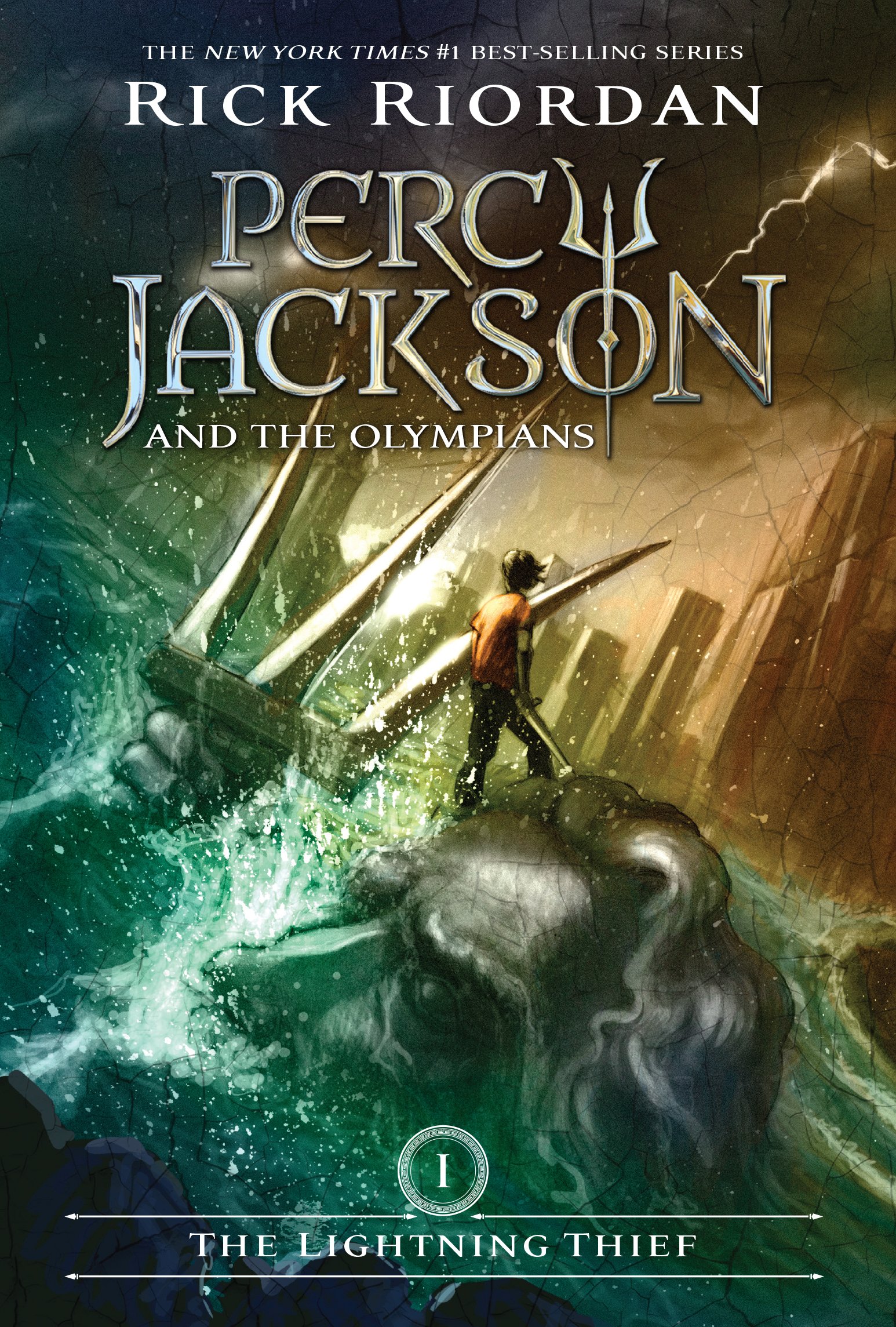
my verdict: Okay this one was actually a much harder choice for me. I think the art style in the US covers is really cool and I like the font and that entire header section more. So even though my nostalgic ass wants to choose the UK one because that is what I grew up reading, I’m going with the US version on this one.
US: 1 | UK: 1

my verdict: EASY choice. Definitely the UK version of this cover. I’m in love with it. It’s much softer which fits the themes of the book and I love this long vertical font style. Also, the colour palette is much nicer too. I think the US version is really fun but the UK one is just too pretty to pass on.
US: 1 | UK: 2

my verdict: ANOTHER easy choice. This is the US version for sure. I love those covers so much I went out of my way to order them online so I could have them instead of the UK ones. The art style is sleek and minimalist, the colour scheme is really pretty and I adore the incorporation of the maps on the side. Plus the font is really cool. The UK one is too busy for me and I don’t like the silhouette design.
US: 2 | UK: 2

my verdict: Okay, I think this is an unpopular opinion. But I’m going with the UK cover. I just love this whole design, the image of Katniss in the HG, the font choice, and the green/black colour. The black one is simple which is nice, but I think it’s a bit boring and it doesn’t draw me in like the UK one. Also, the font looks very awkward compared to the UK one. (I actually own this UK version and fun fact, the cover is reversible so you can flip it to show Peeta in the HG because it’s clear isn’t that NEAT)
US: 2 | UK: 3

my verdict: I adore the US cover of this book and would have bought it if it was available in paperback. The UK version has a pink spine, which is neat, but I just like the US version so much more. The little black girl on the cover is drawn beautifully, and the sign really fits the ‘protest’ theme of the book. White is also much cleaner then black. I do think the UK version is more serious but the UK one is much nicer to look at.
US: 3 | UK: 3

my verdict: I genuinely think these are both nice covers. But I have to give it to the US version again. The turquoise on the black is really nice to look at and I love the golden lines at the bottom as well. Also, the straight aligned text really appeals to me. The UK cover does grab me because the direct eye contact with the model, but the US one is just overall prettier.
US: 4 | UK: 3

my verdict: I am sorry, but I despise the US covers for this series. Although this is probably the nicest of the three I still like the UK one so much more. The font is prettier, and I like the blue colour scheme. The US one is just ugly in my opinion, the person with the yellow with that hideous font is way too much.
US: 4 | UK: 4

my verdict: While the US cover has more metaphorical significance to the book, and probably fits the tone of the book better, I like the UK cover more. It’s just cuter and simpler and the font is much nicer because I really dislike this whole box situation on the US cover. However I honestly think BOTH these covers aren’t as good as they could be.
US: 4 | UK: 5

my verdict: This one is going to the UK yet again. I think the UK cover is very pretty. The colour scheme is so nice and the art on the wall behind the model is very cute. The font is also much nicer. I don’t love the art style in the UK cover and like the real person approach more.
US: 4 | UK: 6
Okay, it was tight for a while there but the UK covers are the winners. I overall don’t think I have much of a preference, it’s really a case by case decision as opposed to overall liking design out of the US or UK more.
Now I can hear you ALL screaming at your phones/computers at how you can’t believe I just didn’t choose your favourite cover which is why I have conveniently made this quiz for you so you can decide yourself whether the UK or US versions are better. Also, I’m totally interested in whether people agree with me or not since I think design preference is a really personal thing, as well as very dependent on culture! I see the UK versions of books much more often so maybe that is why I lean toward them.
And before you go, here is some interesting fun facts I found out about US/UK cover design while researching for this post.
- US publishers tend to go for a more literate and simple design to try to appeal to the most readers across various states, as the market is more complex with a wider range of reader preferences due to the US being much larger than the UK.
- A study in the UK found that 80% of readers disliked faces on covers, so the UK tended to opt for a more artistic and graphic cover style.
- In both the US and the UK, the rise of e-books has lead to an increase in ‘cover extras’ such as embossing and coloured foil implementation in order to create something ‘extra’ and tactile about a physical book.
- It is becoming increasingly common for publishers to use the same cover in the US and UK if the publisher likes one more. For example, Twilight originally had an illustrated cover in the UK, but the UK publishers adopted the US cover after seeing it. The same thing happened to Cassandra Clare’s The Mortal Instruments series and since her covers have always been designed in the US.
- If a publisher has a very successful book, cover design for other books will begin to mimic that successful book. That is why following the success of The Mortal Instruments, many young adult books began to feature people on the cover. I think that the Love, Hate & Other Filters cover is a good example of this. It looks like it’s trying to mimic The Hate U Give’s cover.
AND THAT IS IT ! Thankyou for reading today, and I can’t wait to see what everyone else thinks on the poll. I love cover design and am thinking of making some more posts based around book cover design, so let me know if that is something you’d be interested in!
until next time!